
Digital Watercolor of an Architectural Elevation
I have been exploring a new hybrid “Digital Watercolor” visualization process and recently found an opportunity to try my technique on an architectural elevation. Its now very common for architects to develop conceptual designs using Google SketchUp models and they often represent building elevations that are directly exported from those 3D models. My digital watercolor illustration method requires a few additional modeling steps and some hand coloring, but the results have a remarkable similarity to traditional watercolor paintings - perfect for representing design concepts with an informal, hand-drawn character!
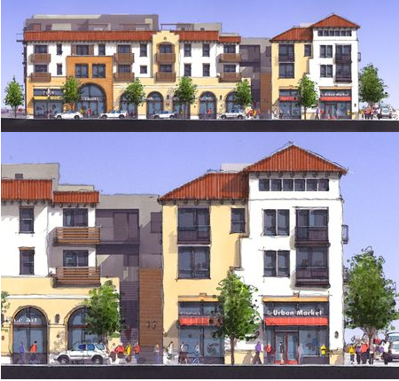
The images below look somewhat repetitive but upon close inspection reveal the individual steps about my process from the initial SketchUp model to the final digital filtering effect. Three software programs were used for this visualization method; 1) Google SketchUp, 2) Shaderlight, and 3) Adobe Photoshop. Here is the story behind this exciting addition to your design communication tool set!
SketchUp Model Development
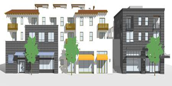
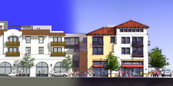
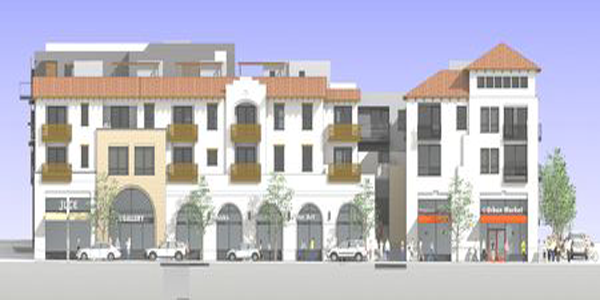
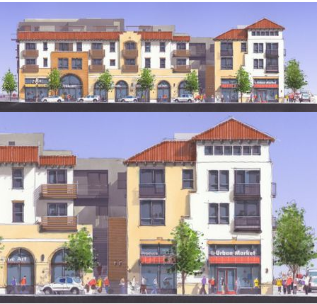
Evolution of the 3D Model. My process began with the SketchUp model created by another architect (top image). The client needed a complete overhaul of the building facade by eliminating its original contemporary box design and reflecting a more traditional mission style massing, fenestration pattern and sloped roof forms. I modified the facade (middle image) and then populated the model with street level entourage that included signage, cars, trees and people. As I developed the model, the client added comments and the elevation continued to improve.
Building Elevation “Step-by-Step”
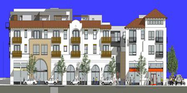
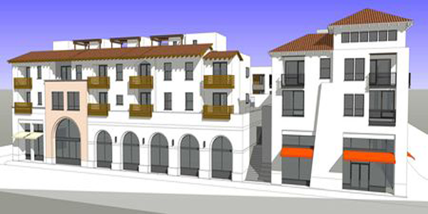
Step 1: Basic SketchUp Elevation. This is the saved view from my updated SketchUp model with a dark blue sky color and shadows carefully positioned to accentuate the building massing. Notice that all of the glass windows have the same even tone of gray color. This is typical of SketchUp rendering output and can be greatly improved by the use of the photorealistic rendering plugin for SketchUp called Shaderlight.
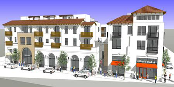
Step 2: Shaderlight Rendered Elevation. I rendered the SketchUp model using Shaderlight and immediately discovered the beautiful quality of light, shadows, glass and especially the graduated blue tones of the sky. I rendered the view at a very high image size in order to capture the greatest amount of detail. Notice that all of the linework disappeared with the photorealistic rendering. A simple method of replacing the linework was to export the lines (edges) only from SketchUp and combine the layers.
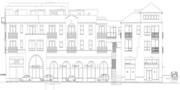
Step 3: Exported SketchUp Edges. In the SketchUp model, I turned off the sky, shadows and materials. I exported a high resolution building elevation which basically captured the edges (linework) of the model. Make sure you export a high resolution file in order to maintain the detail, especially in the hand railings.
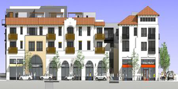
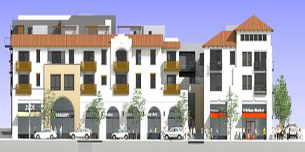
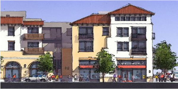
Step 4: Composite Image. I combined the Shaderlight rendering and linework image in Photoshop, merging them into an elevation that has both a high level of model detail and the wonderful quality of light. I kept the layers separate in the Photoshop composite in order to adjust their densities prior to printing.
Step 5: Lightened Composite Image. This was one of the most important steps in the visual process and worth a careful explanation. Reproducing the elevation at full color and line intensity would not allow for additional color to be added. Therefore, it was necessary to lighten both the linework and the building elevation color. In Photoshop, I gave the base image layer a 75% transparency and the linework layer a 50% transparency. Notice the big change in appearance between the images in step 5 versus step 4.
Step 6: Hand Coloring with Markers (with enlarged view). This step was where the digital watercoloring technique originated. I printed the lightened image 10”x17” on heavy weight Epson coated bond paper using my Epson Stylus Photo 2000P printer. I then colored much of the building facade with very light Chartpak AD markers. I accented some of the window mullions and roof edges with a white Prismacolor pencil. I finally traced over many of the building edges, trees and people with a very light graphite pencil. The elevation still looked somewhat faded, but the final filtering step would add contrast back into the image.
Step 7: Photoshop Watercolor Filtering (with enlarged view). I scanned the final hand colored print at 300 dpi and imported the image into Adobe Photoshop. Using the watercolor filter, I applied the filter only once to the image and adjusted the contrast levels to deepen the blacks and lighten the whites of the image. This filtering process created the wonderful character for the image and coupled with the pencil linework gave the overall elevation an informal hand drawn and painted quality.
Step 8: Additional Watercolor Filtering (unsuccessful). Out of curiosity, I applied a second round of watercolor filtering to the image. The additional filtering distorted the image too much and was unsuccessful in improving the watercolor effect. I did not use this version for any presentation.
My hybrid digital watercolor process is a new visual tool for designers and I recommend that you first try following these steps and then experimenting with your own digital painting process. Let me know if you find a new and improved method and I’ll share your findings with others! Good luck!

- Sponsored Plugins


- Sponsored Plugins

- Cover Story
-
 SketchUp Can Help You Win Interior..
 -
Best Laptops for SketchUp
-
How to Resize Textures and Materials..
-
Discovering SketchUp 2020
-
Line Rendering with SketchUp and VRay
-
Pushing The Boundary with architectural
-
Trimble Visiting Professionals Program
-
Diagonal Tile Planning in SketchUp
-
Highlights of some amazing 3D Printed
-
Review of a new SketchUp Guide
- Sketchup Resources
-
SKP for iphone/ipad
-
SKP for terrain modeling
-
Pool Water In Vray Sketchup
-
Rendering Optimization In Vray Sketchup
-
Background Modification In sketchup
-
Grass Making with sketchup fur plugin
-
Landscape designing in Sketchup
-
Apply styles with sketchup
-
Bedroom Making with sketchup
-
Review of Rendering Software
-
Enhancing rendering for 3d modeling
-
The combination of sketchup
-
Exterior Night Scene rendering with vray