
Author : Arpad Varga
Three dimensional data visualization and analysis with Sketchup
One of todays greatest global problems is energy efficiency. In our daily life, we are energy efficient when we use low energy light bulbs, when we buy a more efficient fridge, or when we are using motion detection in public illumination. In the industry the solution of this problem is not only to replace old equipments with new more efficient ones, but to plan the energy production and transportation as well. For example, if we can plan the gas consumption of a given city, we can report our gas need for the gas production entities, therefore we can buy gas on lower price, and finally the domestic consumers will get gas on lower price as well. OK, but how do we plan gas consumption?
Prediction of gas consumption is a complex problem, we have to consider multiple factors, to produce the most accurate results. In case of such complex mathematical problems not the solution is the only difficulty. We have to represent our data in a way, which is easy understandable for others as well. CASON Engineering PLC, where I’m working as well, is a pioneer in gas industrial solutions. We developed many solutions never existing before. Such an innovation is my method of consumption profiling, where data visualization and analysis is part of the process.
Until now, gas consumption data were always stored and shown in tabular format and simple graphs. All we have to know is on the invoice we receive from the local gas provider: consumption period, location, amount, and of course the price. Such data can be easily illustrated on usual descartian graphs, but from such graphs it’s pretty hard to read the trend of consumption when we are talking about long periods, and it’s even harder to recognize any correlation in the consumption parameters, because all we represent on a XY graph is the correlation of two things, flat 2D. Domestic gas consumption for example more likely has a period of one week, and consumption is dependent on weather. So we have at least three different things: time, weather and consumption we would like to represent on the same graph. Sure, we can draw multiple lines in the same graph, but it’s hard to analyze the correlations. This is where 3D representation comes into picture, let’s see how we do this with Sketchup.
Tabular data is converted to three dimensional Sketchup surfaces (meshes) or group of objects with Ruby scripts. This process allows us to join meta data to each of our Sketchup object, giving us the possibility to create tools for data analysis. Still inside Sketchup. Object attributes for example can hold information about all the parameters of the given gas consumption data, and using this meta data we can create tools, to filter the objects in the scene based on any of the attributes. For example, we could decide to look for all data where environmental the temperature was over 10 degrees. If we get these points, all we have to do is to look at our scene, and we immediately get the impression of how our consumer behaves at springtime. Or we can use attribute filtering to group consumption points by consumption time, we can color the objects based the time, and immediately we get the fourth dimension in our visualization. Let’s look to some examples, how we do this.
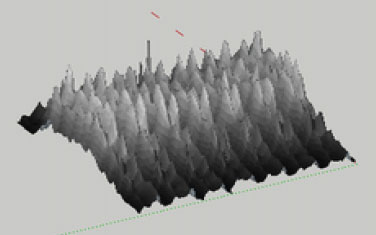
Gas consumption in four dimensions.
Shown parameters are: consumed gas in cubic meters, consumption timestamp, environmental temperature and consumption period (month).
Consumption data was loaded from CSV file with the help of some Ruby scripts.

Using Sketchup we have the ability to rotate our scene and observe any of it’s aspects, and with the help of meta data, we can deep-analyze the scene. The picture above shows coloring technique used for consumption period visualization. On the three axis we got temperature, consumption and consumption timestamp, and we got the month of consumption in the colors. We see, how different seasons are changing the behaviour of our consumer.
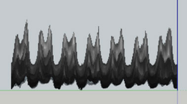
Simple gas consumption mesh.
Shown parameters are: consumed gas in cubic meters, hour of consumption timestamp, day of consumption timestamp.
To help the analysis, we used consumption dependent coloring (black means lower while orange means higher consumption) and section panes available in Sketchup. The fraction highlighted by the section pane shows a peak in the consumption trend. When we move or section pane along the consumption mesh, we will see an animation of the gas consumption trends in time, which can help us to understand how the consumption behaviour is changing during a given period.

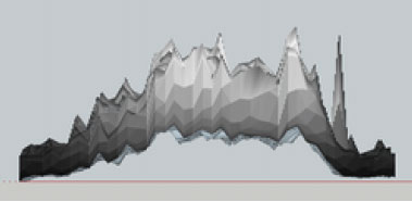
Complex consumption profile visualization on weekly basis.
Shown parameters are: consumed gas in cubic meters, time of consumption timestamp, date of consumption timestamp.
This is a totally new method to display such data. The curiosity of this method is that it compresses three different kind of profiles into one, and so gives us the ability to see and recognize correlations and consequences.
Viewpoint: Overview. We see, how consumption is changing in time.
Viewpoint: Front. From this view, we will see the weekly profile of our consumer.
Viewpoint: Side. Side view shows the yearly run of the consumption.
This visualization method combined with my forecasting algorithm can give a very accurate prediction and an easily understandable, comparable and analyzable representation of data in gas industry. Sketchup makes it easy to put two or more meshes side by side and compare them. How we use it is upon our creativity. There are so many other scenarios we can use three dimensional visualization of our data, and Sketchup gives us a very flexible and extensible solution to do this in minutes. Did you ever have the need to represent something for the board, which is dense enough to be understood in minutes, yet holding every aspects it’s related to? Three dimensional scenes are something your boss will always love to see in a presentation, I think.
In my next article, I will deep-dive into the scripting part of importing tabular data into Sketchup meshes.

- Sponsored Plugins

- Sponsored Plugins

- Cover Story
-
 SketchUp Can Help You Win Interior..
 -
Best Laptops for SketchUp
-
How to Resize Textures and Materials..
-
Discovering SketchUp 2020
-
Line Rendering with SketchUp and VRay
-
Pushing The Boundary with architectural
-
Trimble Visiting Professionals Program
-
Diagonal Tile Planning in SketchUp
-
Highlights of some amazing 3D Printed
-
Review of a new SketchUp Guide
- Sketchup Resources
-
SKP for iphone/ipad
-
SKP for terrain modeling
-
Pool Water In Vray Sketchup
-
Rendering Optimization In Vray Sketchup
-
Background Modification In sketchup
-
Grass Making with sketchup fur plugin
-
Landscape designing in Sketchup
-
Apply styles with sketchup
-
Bedroom Making with sketchup
-
Review of Rendering Software
-
Enhancing rendering for 3d modeling
-
The combination of sketchup
-
Exterior Night Scene rendering with vray